The Rise of Neumorphism: How Soft UI is Changing Web Design in 2024

neumorphism

As we step into 2024, the world of web design continues to evolve, with new trends pushing the boundaries of how we interact with digital spaces. One of the design trends making a significant impact is Neumorphism, also known as Soft UI. This design style combines the simplicity of flat design with subtle, three-dimensional elements, creating interfaces that are modern yet intuitive. Neumorphism offers a fresh approach to user experience, blending digital and physical aesthetics in a way that feels both familiar and innovative.

In this article, we’ll explore what Neumorphism is all about, why it’s becoming so popular, and how it’s influencing the future of web design. Whether you’re a business owner looking to revamp your website or a designer staying on top of trends, understanding Neumorphism can help you stay ahead in a rapidly changing digital landscape.

What is Neumorphism?

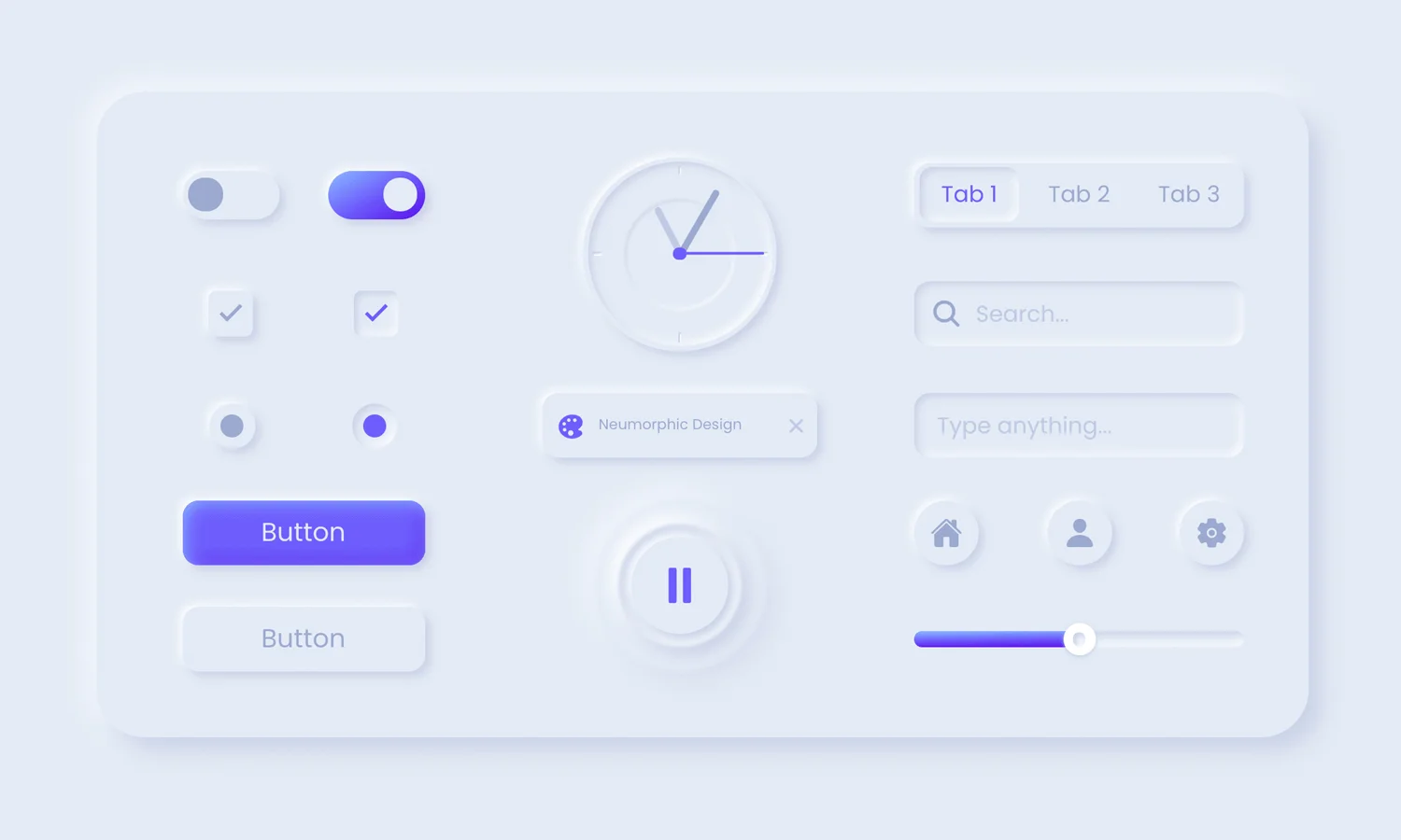
Neumorphism, often described as the next generation of skeuomorphic design, takes inspiration from the old-school design technique of mimicking real-world objects in digital form. However, where skeuomorphism could sometimes feel too heavy or detailed, Neumorphism offers a softer, more minimalist take. It focuses on subtle shadows and light sources, creating a soft 3D effect that makes buttons, icons, and other elements appear to “float” on the page.

The beauty of Neumorphism lies in its ability to make interactive elements stand out without overwhelming the user. It creates a sense of depth, but unlike traditional 3D designs, it maintains the clean, simple aesthetics that are crucial in modern web design. This balance between minimalism and realism is why so many designers are excited about its potential in 2024.
Why Neumorphism is Trending in 2024

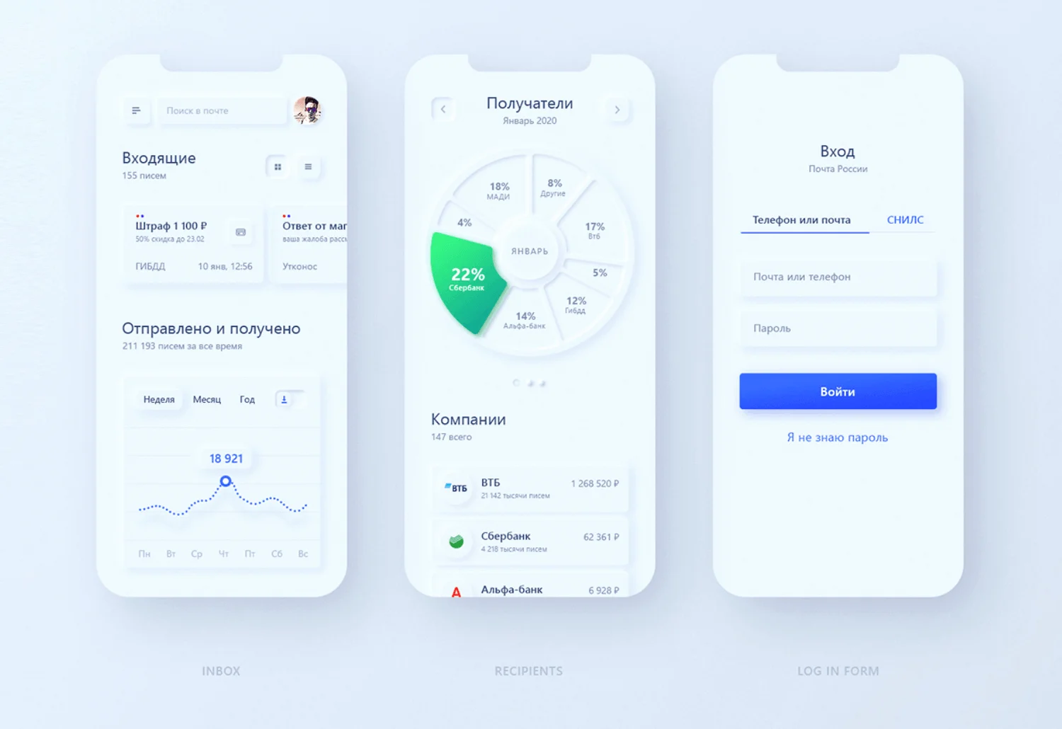
Neumorphism is catching on quickly for a few key reasons. First, it offers a fresh, engaging user experience. In a world where most designs lean heavily on flat, simplistic elements, Neumorphism adds a sense of interactivity. Users appreciate interfaces that feel responsive and dynamic, and Neumorphism provides just that through subtle visual cues that make digital elements feel tangible.

Moreover, Neumorphism fits perfectly within the broader trend of minimalism that’s been dominating web design for years. While minimalism focuses on keeping things clean and uncluttered, Neumorphism enhances this simplicity with light, shadow, and texture, creating a more visually interesting experience without complicating the design. For businesses looking to create a polished, modern look, it’s a trend that offers both functionality and style.

The beauty of Neumorphism lies in its ability to make interactive elements stand out without overwhelming the user. It creates a sense of depth, but unlike traditional 3D designs, it maintains the clean, simple aesthetics that are crucial in modern web design. This balance between minimalism and realism is why so many designers are excited about its potential in 2024.

How to Implement Neumorphism Effectively

While Neumorphism has a lot of potential, it’s important to implement it carefully. One of the biggest challenges with this design style is maintaining good contrast. The soft shadows and highlights that give Neumorphism its signature look can sometimes make it hard to differentiate between interactive elements and the background. This is particularly important for accessibility—a site must remain easy to navigate for all users, including those with visual impairments.

Another key consideration is moderation. Neumorphism works best when used sparingly. Overloading a page with too many soft, floating elements can actually reduce usability, making the interface feel more confusing than engaging. Designers are finding that a hybrid approach—combining Neumorphism with flat design elements—often delivers the best results, balancing aesthetics and usability.

Moreover, Neumorphism fits perfectly within the broader trend of minimalism that’s been dominating web design for years. While minimalism focuses on keeping things clean and uncluttered, Neumorphism enhances this simplicity with light, shadow, and texture, creating a more visually interesting experience without complicating the design. For businesses looking to create a polished, modern look, it’s a trend that offers both functionality and style.

The beauty of Neumorphism lies in its ability to make interactive elements stand out without overwhelming the user. It creates a sense of depth, but unlike traditional 3D designs, it maintains the clean, simple aesthetics that are crucial in modern web design. This balance between minimalism and realism is why so many designers are excited about its potential in 2024.

What’s Next for Neumorphism?

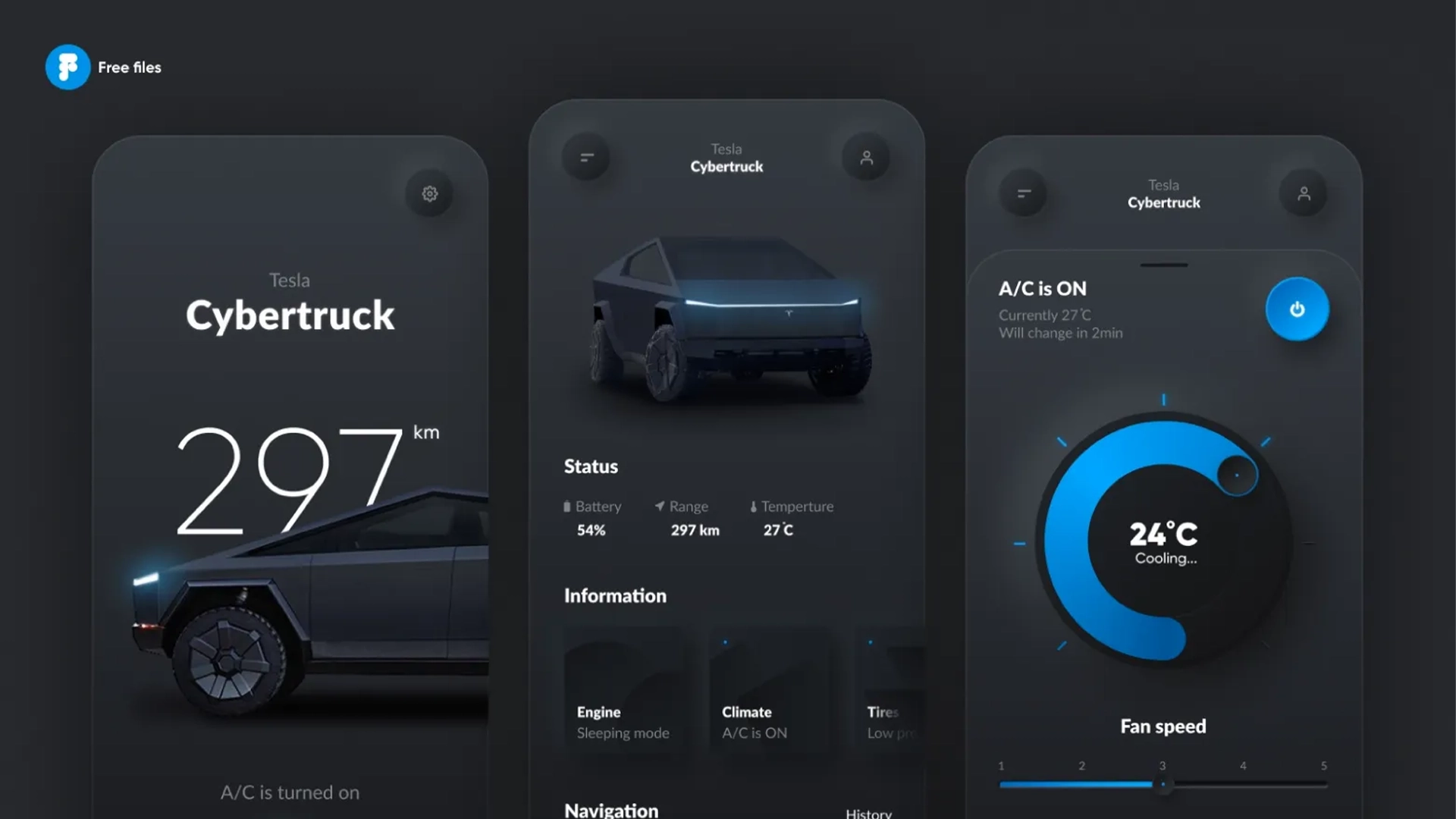
As more businesses and designers experiment with Neumorphism, we’re likely to see the trend evolve further. Some are already blending Neumorphism with other design trends, like Glassmorphism, which introduces translucent, frosted-glass effects to create even more depth. We may also see Neumorphism applied in different ways, like in dark mode designs, where contrast is naturally heightened, allowing the soft shadows to stand out more effectively.

Whatever direction Neumorphism takes, it’s clear that its influence will continue to shape web design well into 2024. It offers a fresh perspective on how we can build engaging, user-friendly websites that look and feel modern without sacrificing the simplicity that users have come to expect.

Another key consideration is moderation. Neumorphism works best when used sparingly. Overloading a page with too many soft, floating elements can actually reduce usability, making the interface feel more confusing than engaging. Designers are finding that a hybrid approach—combining Neumorphism with flat design elements—often delivers the best results, balancing aesthetics and usability.

Moreover, Neumorphism fits perfectly within the broader trend of minimalism that’s been dominating web design for years. While minimalism focuses on keeping things clean and uncluttered, Neumorphism enhances this simplicity with light, shadow, and texture, creating a more visually interesting experience without complicating the design. For businesses looking to create a polished, modern look, it’s a trend that offers both functionality and style.

The beauty of Neumorphism lies in its ability to make interactive elements stand out without overwhelming the user. It creates a sense of depth, but unlike traditional 3D designs, it maintains the clean, simple aesthetics that are crucial in modern web design. This balance between minimalism and realism is why so many designers are excited about its potential in 2024.

Conclusion

Neumorphism is much more than a fleeting trend—it’s a design approach that has the potential to change how we think about digital interfaces. By blending subtle 3D effects with the clean lines of minimalism, it offers a way to create intuitive, visually appealing websites that users enjoy interacting with. As we move through 2024, embracing Neumorphism could give your website the modern, polished look it needs to stand out in an increasingly competitive online world. Our Team at That Nerd Studio specializes in creating Neumorphic Designs for mobile apps, web apps and desktop apps. Reach out to us now and get your app the design it deserves!