

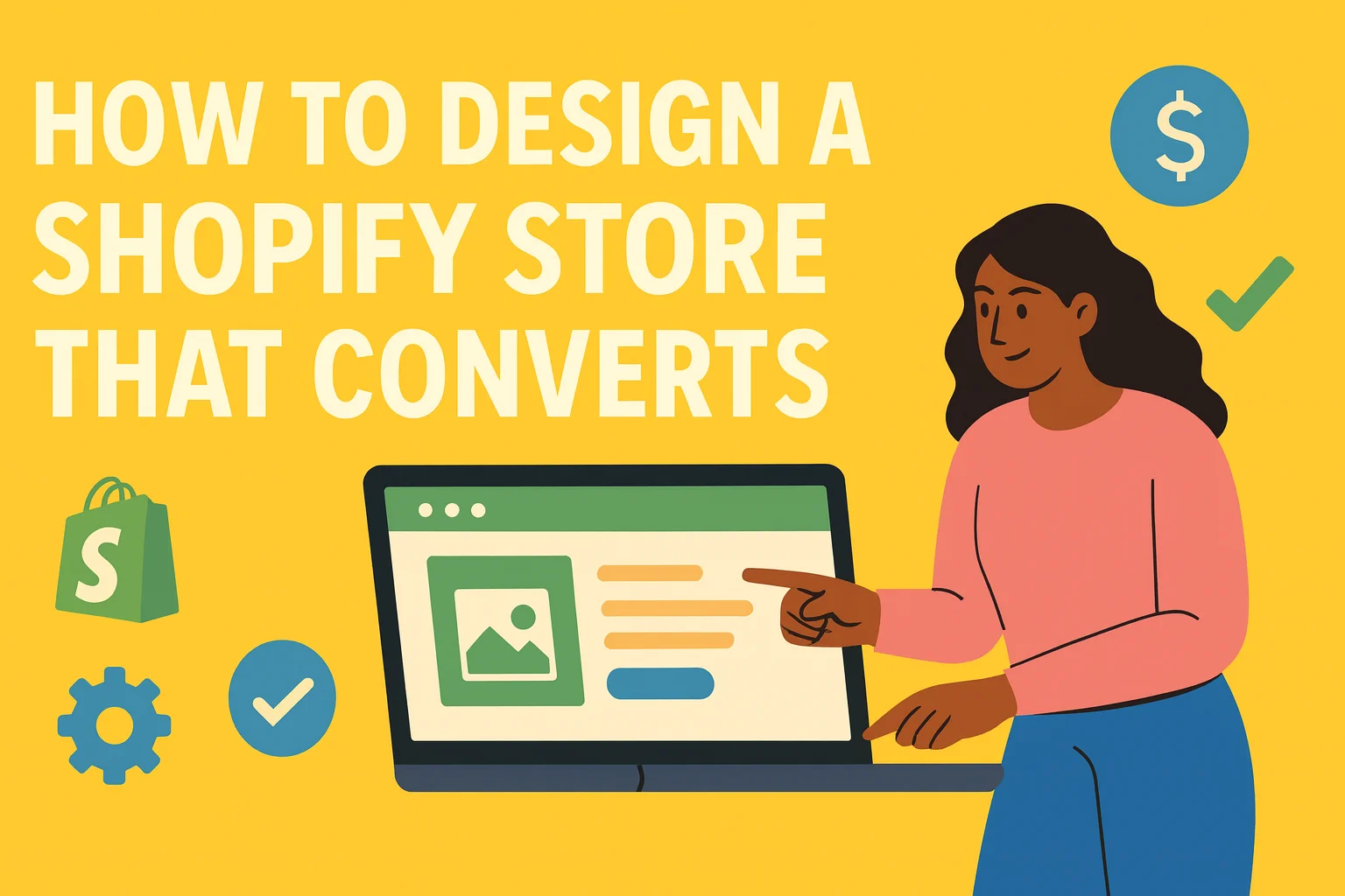
Design is more than just pretty colors and nice fonts. For Shopify stores, design is about conversion. If your layout looks good but doesn’t get people to buy, it’s failing. This guide walks through what actually makes a Shopify store convert, based on what works for US shoppers in 2025. Whether you’re designing it yourself or working with a team, these are the things you need to get right from day one.
10 Shopify Design Rules That Actually Convert (US 2025)
1. Start With One Clear Goal Per Page
Most Shopify stores try to do too much at once. The homepage promotes 10 products, 5 discounts, and a welcome popup. The result? Confusion. The most successful Shopify stores keep it simple. Every page has one job.
- Homepage: Build trust and guide to your best-seller
- Product page: Get them to click “Add to cart”
- Cart page: Get them to check out without distraction
Cut out anything that doesn’t help the page accomplish its main goal. US shoppers are impatient. If they can’t figure out where to go or what to do, they leave.
2. Use Real Brand Messaging, Not Fluff
Your design should tell people why they should care about your brand. Generic taglines like “Crafted with love” or “We believe in quality” don’t mean anything anymore. Instead, say what makes you different. And say it fast.
✅ “Premium grooming tools for Black men, designed by barbers”
✅ “Snacks with 80% less sugar, made for diabetic families”
✅ “Plant-based skincare built for Texas heat”
Put that message right at the top of your homepage. Make it obvious.
3. Keep Your Navigation Minimal
Most Shopify themes let you pack your navigation bar with 10+ links. Don’t. For stores in the US market, the sweet spot is 3 to 5 primary links in your header, such as:
✅ Shop
✅ About
✅ Best Sellers
✅ Contact
✅ Login / Account
Add search and cart icons. That’s it. The cleaner your navigation, the easier it is for users to focus on shopping.
4. Invest in Real Product Photos
This is non-negotiable. Your product photos are the most important design element on the entire site. If you’re using grainy images, mockups, or random stock shots, you’re leaving money on the table. What works:
✅ White background shots
✅ Close-ups of details (texture, ingredients, labels)
✅ Lifestyle shots with real people using the product
✅ Multiple angles — not just front-facing
US shoppers want to know what they’re buying. Show it, clearly.
5. Design for Mobile First
More than 70% of Shopify traffic in the US comes from mobile. If your store isn’t optimized for phones, you’re losing more than half your potential customers. Mobile design checklist:
✅ No horizontal scroll
✅ No overlapping text or CTAs
✅ Clickable buttons with room to breathe
✅ Fast-loading images (use WebP format)
✅ Cart icon always visible
Always test your design on at least three different phone sizes before launch.
6. Build Trust Above the Fold
Before a user even scrolls, they should feel like they can trust you. Ways to build trust instantly:
✅ Display review stars on product cards
✅ Show security badges near your checkout button
✅ Add a link to your return policy in the footer
✅ Mention fast US-based shipping or satisfaction guarantees
Don’t bury this info. Make it visible, especially for first-time visitors.
7. Use One CTA Per Screen
A lot of Shopify stores have 3–4 buttons competing for attention on every page. Instead, stick to one clear call-to-action per section or scroll screen. For example:
✅ “Shop New Arrivals”
✅ “Add to Cart”
✅ “Get 10% Off First Order”
Every CTA should be focused on moving the shopper closer to purchase. Use bold, high-contrast buttons. Avoid “ghost” buttons or vague text like “Learn More.”
8. Don’t Overcomplicate the Theme
You don’t need flashy animations or parallax effects. You need something clean, fast, and focused on the customer journey. Choose a Shopify theme that prioritizes:
✅ Fast page load speed
✅ Clear layout with space between sections
✅ Accessible design (font sizes, contrast, readability)
✅ Compatible with Shopify 2.0 blocks
Less is more — especially if your target audience includes older shoppers or first-time online buyers.
9. Optimize the Product Page
Your product pages should be your best salespeople. Here’s what to include, in this order:
✅ Product title
✅ Price
✅ High-quality images
✅ Short benefit-focused description
✅ Size, variant, or quantity selector
✅ Add to Cart button
✅ Reviews
✅ Shipping & return info
✅ Suggested products (not more than 4)
Don’t write essays. Keep descriptions clear, skimmable, and focused on outcomes.
10.Use Apps That Don’t Kill Speed
Shopify’s App Store has thousands of apps — but installing too many will slow your store down. Focus on 3–5 high-impact apps including:
✅ Judge.me for reviews
✅ Klaviyo or Omnisend for email
✅ ReConvert for post-purchase upsells
✅ Lucky Orange for heatmaps
✅ Shogun or PageFly for custom landing pages
Always check how each app affects your speed using Shopify’s built-in performance reports.
That Nerd Studio Builds Shopify Stores That Convert
Designing your own Shopify store is doable. But if you want to skip trial and error and get it right from the start, partner with a team that lives and breathes Shopify. That Nerd Studio helps US brands design and develop Shopify stores that aren’t just beautiful — they convert. What TNS does:
✅ Custom Shopify themes designed around your product & audience
✅ Conversion-focused layout strategy
✅ CRO-ready product pages
✅ Mobile-first optimization
✅ Ongoing A/B testing and support
Whether you’re starting from scratch or redesigning an existing store, That Nerd Studio helps you create a shopping experience that actually leads to sales.
Final Thoughts
Shopify makes it easy to launch an online store. But building a store that performs is about smart design, not just good looks. If you focus on clarity, usability, and trust — and cut the clutter — your store is already ahead of most new brands in the US market. And if you want expert support, That Nerd Studio is here to help you build a store that works on day one – visit us today!