

The homepage is where most Shopify stores either hook a visitor or lose them. It’s not just about looking good. It’s about guiding someone to take the next step—browse a product, check out a collection, or trust you enough to scroll further.
If your homepage isn’t converting, there’s probably too much going on or not enough clarity. Here’s how we approach homepage design at That Nerd Studio, especially for US-based brands.
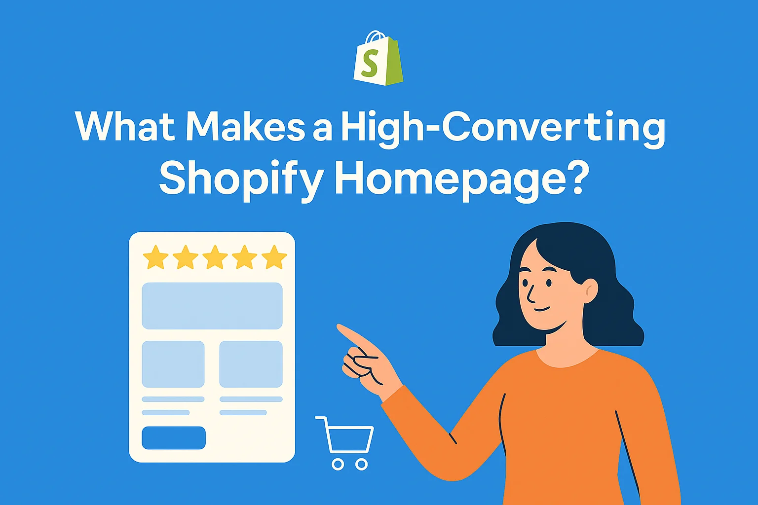
What Your Homepage Needs (And What to Leave Out)
1. Start with a clear headline
Within the first five seconds, a visitor should understand what your brand does and who it’s for. Don’t use vague slogans. Say exactly what you offer.
Example:
“Vegan skincare designed for sensitive skin in dry climates.”
Pair it with a clean image and one call-to-action like “Shop Now” or “See Best Sellers.”
2. Social proof early
People trust people. Add reviews, testimonials, or logos of publications you’ve been featured in. If you’re new and don’t have press coverage, display customer star ratings or even a short quote from a happy customer.
3. Show your best products or collections
Don’t dump everything onto the homepage. Highlight your most popular items, new arrivals, or curated collections. The goal is to help shoppers find something they want without thinking too hard.
4. Make navigation effortless
Limit your main navigation to 3 to 5 links. Add a cart icon, search, and maybe a login. Use a sticky header if possible, so people can get around easily without having to scroll back up.
5. Use promo space wisely
Instead of cluttering your layout with five sales messages, use one bar or block to promote a current offer. Something like “Free shipping on orders over $50” or “First-time buyers get 10% off” works well. Keep it short and easy to see.
6. Stay consistent with your brand
If your packaging is minimal, your homepage should reflect that. If your social presence is fun and bold, bring those colors and copy into your site. Your homepage should feel like a natural extension of your brand, not a generic Shopify theme.
✅ Make sure it works great on mobile
Most of your US traffic is coming from phones. Big buttons, clear spacing, and fast loading are all key. Don’t assume your desktop design will translate well—test it.
Common Problems That Kill Conversions
- ✅ Too many product categories on the homepage
- ✅ No real direction or flow
- ✅ Sliders or autoplay carousels that distract rather than guide
- ✅ A headline that sounds good but doesn’t explain anything
- ✅ Zero urgency or incentive to keep exploring
A Homepage That Converts Has a Flow
Here’s a basic structure we’ve used with several US clients that consistently performs:
- ✅ Headline and subheadline with a strong CTA
- ✅ Featured product or collection
- ✅ A few short reviews or social proof section
- ✅ Brand mission or story in 1-2 sentences
- ✅ New arrivals or best sellers
- ✅ Offer banner or email signup
- ✅ Instagram or user-generated content
- ✅ Footer with support links, policies, and trust signals
Every section has a job. It’s not just about stacking content. You’re walking the customer through a journey, and each scroll should have a purpose.
How We Build It at That Nerd Studio
We don’t just plug in a Shopify theme and call it a day. At TNS, we start every homepage design in Figma. That gives us full control over layout, spacing, and visual flow before any code is written.We use real content and actual product images, not placeholders. Our designers think in terms of UX and CRO from the start. Then we build it in Shopify using clean, modular sections that are easy to update later.
Need help writing a better headline? We handle that too. We’ve written and tested dozens of value props, hero sections, and promo banners across different industries. If you don’t know what to say, we help you figure it out.
Real Results, Real Stores
One of our US clients came to us with a homepage that looked decent but had no structure. It had three CTAs above the fold, an autoplay slider, and no product showcase until three scrolls down. We rebuilt it with a clearer message, strong visuals, and simplified layout.
Their bounce rate dropped by 32%. Time on site went up. And most importantly, their conversion rate doubled within six weeks. Good homepage design makes people stay. Great homepage design makes them act.
Final Thoughts
If your homepage is trying to do too much, chances are it’s not doing much at all. A clean, focused homepage helps visitors know what you sell, why it matters, and where to go next. And if you want help putting that together, That Nerd Studio is ready to jump in. We don’t just make Shopify stores look nice. We build them to convert.